There are a wide range of website styles and designs used in the construction industry, ranging from single page versions to the more complex mobile responsive designs for smart phones and tablets. Regardless of formats used, excellent photography is key to the visual impact of construction industry websites today.
Great photography boosts website appeal in the commercial construction industry. A varied assortment of our favourites follows:
ANDERSON
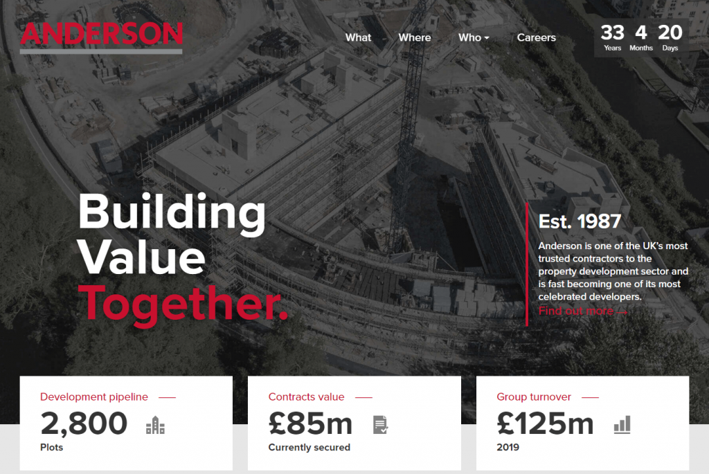
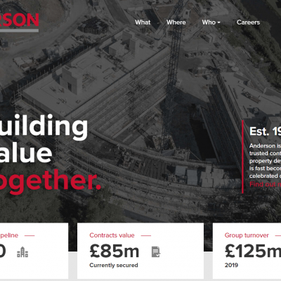
Some great photography and moody atmospherics helps give the site a dramatic intrigue and a certain magnetic appeal.
BALFOUR BEATTY
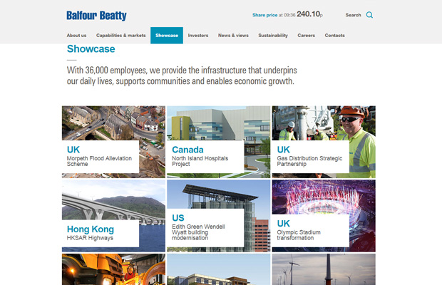
A really good showcase of global projects making Balfour Beatty a powerhouse when it comes to international infrastructure operations.
BECHTEL

A superior website from one of the most respected engineering, construction and project management companies in the world. A pictorial feast of engineering wizardry.
GRAHAM
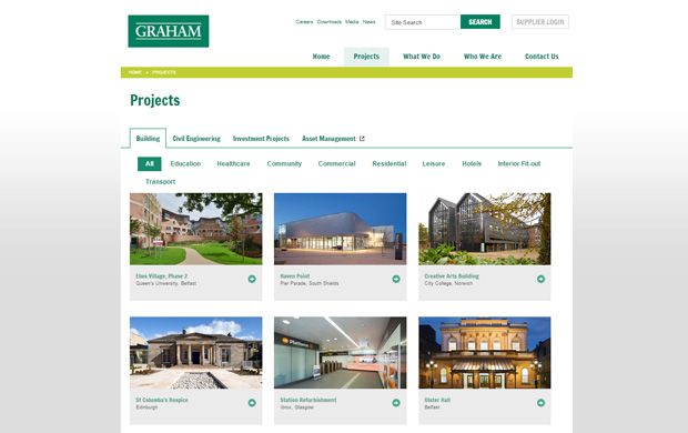
A vast array of impressive infrastructure projects throughout the UK. The showcase menu is structured well and easy to read – a nice touch with each project swapping around when scrolling across the sub headings in each category.
KIER
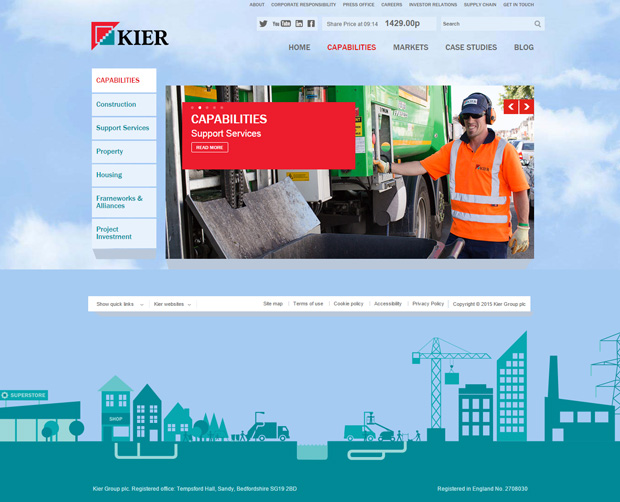
A fun vector graphic used as a footer showing in simplistic form of some of the services that Kier provide from construction and property development to facilities management and project investments.
MASTERSON HOLDINGS
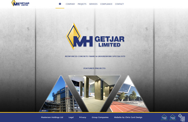
The use of a concrete image for the background makes for a very masculine website and in the words of the Ronseal ads ‘does exactly what it says on the tin’ – after all the company are reinforced concrete and groundwork specialists.
MORGAN SINDALL GROUP
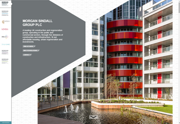
The triangular grid background of this website forms a good basis for the geometric shapes of the imagery and text panels to work together. The movement of these layers shifting independently when scrolling down gives extra appeal to the browsing experience.
RG CARTER
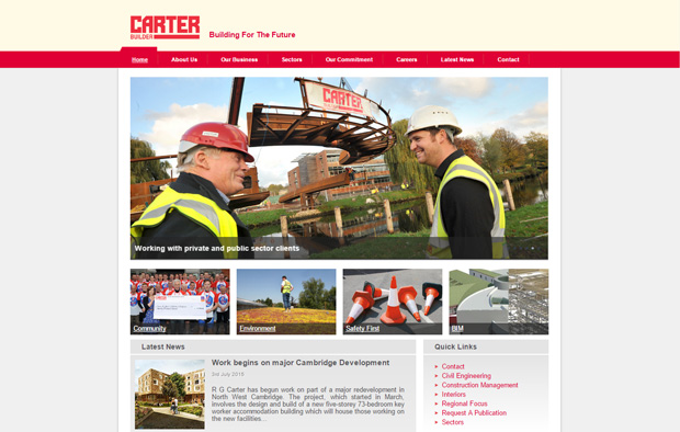
www.rgcarter-construction.co.uk
A straight forward layout design making the navigability very easy especially for the uninitiated.
SHERRI BUILDERS
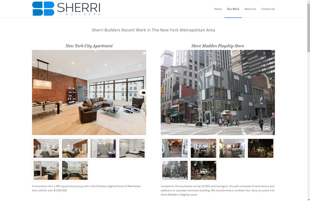
Very professional imagery used made all the more interesting with the way that each image emerges into view giving the site a more dynamic feel.
WILLMOTT DIXON
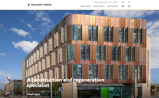
A visual treat showing full width photography for the greater impact emphasizing WD’s commitment to being proud of their chosen industry and in particular their achievements.
If you’re interested updating your web design or digital marketing strategy, then get in touch with us today!
