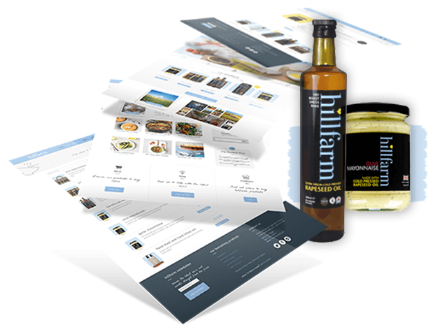

Rapeseed oil has flourished in popularity recently and Hillfarm Oils needed to start focusing on promoting their own, Suffolk made rapeseed products, which meant a complete review and redesign of their existing website.
The new platform had to highlight the virtues of the oil itself, the rest of the Hillfarm range, and encompass the healthy living, good life philosophy behind the brand – luckily, we’re not ones to shy away from a challenge, so we greased the cogs and set to work.


We were invited to Hillfarm, to find out exactly how cold pressing rapeseed actually works, so, donning our wellies, we set off into the Suffolk sunrise.
After getting to grips with the processes and understanding what Hillfarm wanted to achieve, we did some brainstorming – mapping out the key demographic, understanding customer journeys and devising rough ideas of aesthetics and structure.
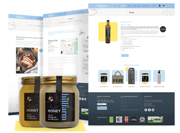
We needed to ensure that we really highlighted the virtues and strengths of rapeseed oil and make consumers understand the health and wellbeing benefits; we also had to combine this with fully transactional, ecommerce pages with a strong call to action.

Working closely with Hillfarm throughout the design and build meant the final aesthetic perfectly reflected their fresh and outdoorsy approach to life and living.
The commercial results speak for themselves and more than a quarter of customers return time and time again – making it clear that not only do they agree that Hillfarm products are worth coming back for, but that the site is engaging and interesting.
The finished website is fully responsive and has seen a dramatic increase in sales coming from mobile devices – making up 40% of all trade. Conversion is particularly high with tablet users so we’re confident that the site functions efficiently across multiple platforms.
This was a great project to work on and solidified our ability to work on a brief with multiple aspects, as well as maximising the potential of mobile audiences. Visit: hillfarmoils.com

Discover how our team can help you on your journey.
Talk to us today