Before our developers start on the complicated business of building your website, there are a couple of steps in the creative process we like to go through first.
Our designers will create wireframes of your new website, and once you’re happy with them they’ll create visuals too. But what are wireframes and visuals, and why do we create them?

Wireframes
What are they?
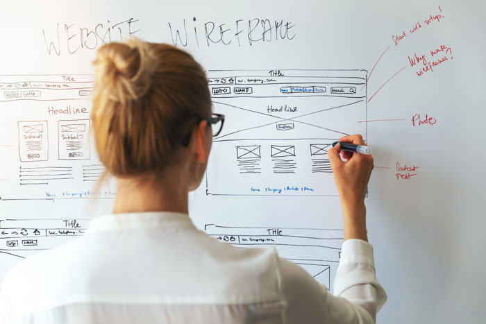
Wireframes are like a floorplan of a house only for a website. They don’t show you exactly what the finished product will look like but they show you what’s included and how it’s laid out. They’ll normally be sent to you as a link to a set of flat images that you can view online.
What do they look like?
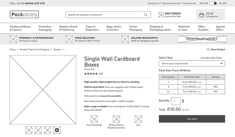
Wireframes share similarities with how a floorplan of a house looks too: they’re normally pretty basic, in black and white with boxes and shapes to show where different elements will go. Wireframes will show things like where an image or a button will go but it won’t include an actual image or the colour or styling of the button.

Example of a product page wireframe for an ecommerce website.
Why do we do them?
We create wireframes to show you a visual representation of how your website will be structured. It helps to understand the user journeys and the UX (user experience) throughout the site. We want to make sure you’re happy with the content included and how it’s laid out before we get to work on styling it up.
Visuals
What are they?
Once we’ve done wireframes and we know you’re happy with the content structure and layout of your site, we move on to visuals. This is where we start applying your brand to the design. Visuals are created to give you an idea of how the website will actually look and feel. They’re still just flat images, usually sent via a link – not a working website that you can click through.
What do they look like?
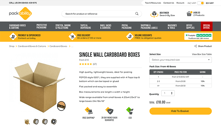
Visuals will look and feel like the real thing with a few small differences. Visuals will include your branding, colouring, and imagery but they may not always use all of your content. We often use something called ‘Lorem Ipsum’, which is a form of placeholder text, until your copy is ready. This means you can see what your website will look like filled with text without having to have all your copy ready at this point. Often the visuals can actually help you in the process of writing your copy, too, as they give you an idea of where text is needed and how much.
This can also be the case for imagery. We may use stock photographs as placeholders to give you an idea of the sort of photo you might want if you haven’t had your photography done yet.

The final visual for an ecommerce product page
Why do we do them?
We want to make sure you’re happy with the look and style of your website before we pass it to the developers to build the working site for you. If there’s something you dislike or want to add, we can work that out together before the building process begins. Then the developers can be sure they’re building your site exactly how you want it.
As mentioned before, visuals can also help to guide you in how much content you want to write and what kind of photography you want (if you don’t already know). Visuals can also help as a reference point between you and us while you share your content with us ready for the finished website.
Obviously wireframes and visuals are two very different things but we do them both for the same reasons: to save on wasted time and mistakes, to help communicate with you on your website requirements and how we’re interpreting them, and to make sure we deliver you the exact website that you want and need.


