
As we discussed the project, we were tasked with developing five further country specific micro-sites, each with a tailored marketing campaign. This would be one of the most complex tasks we’d ever had to work on and we had teams working round the clock to devise a solution that would meet all the requirements.
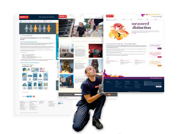
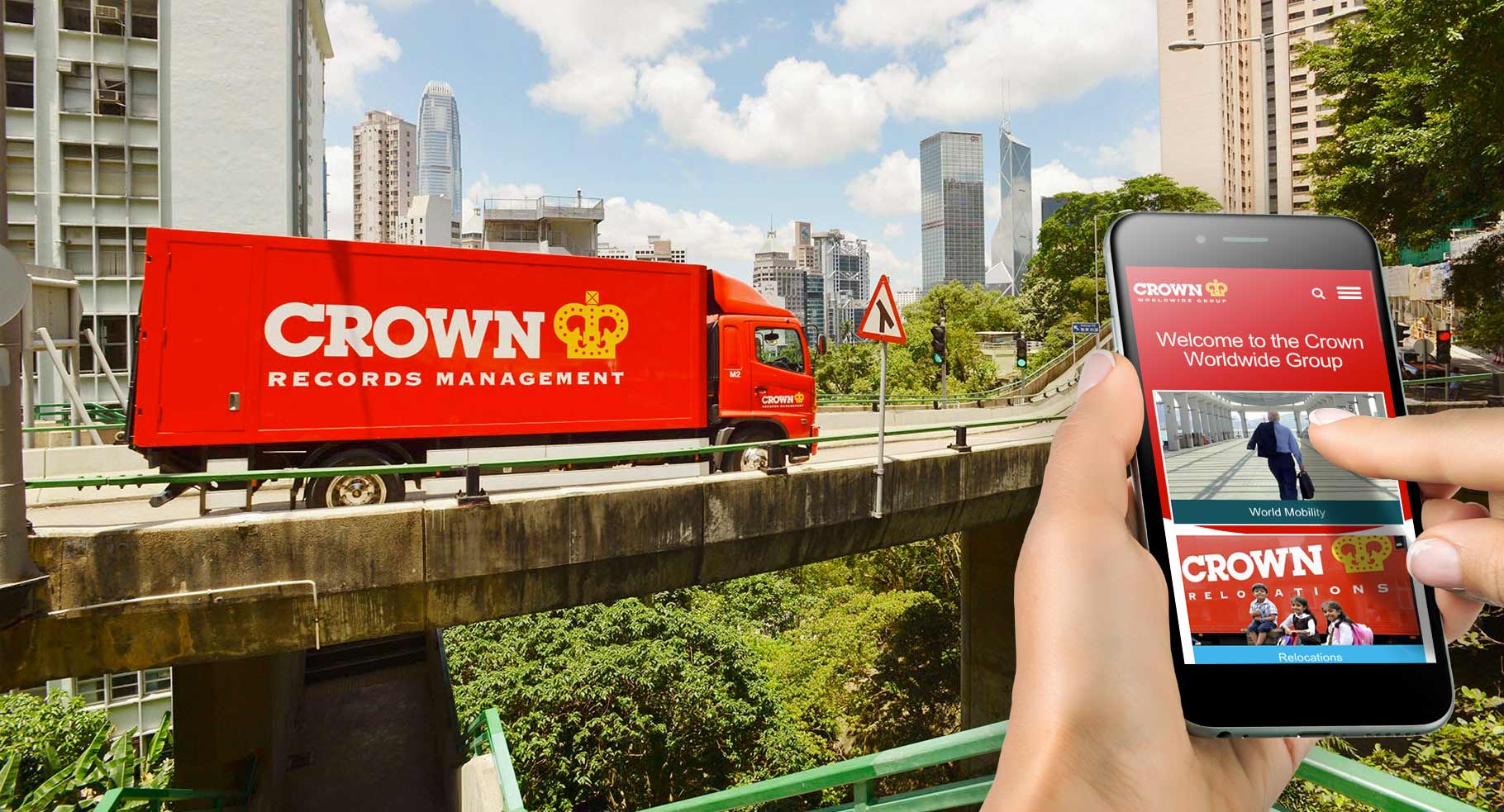
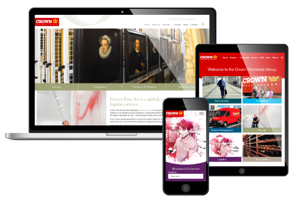
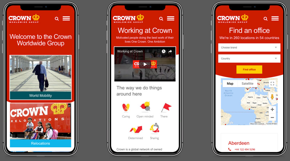
We decided to focus on what unified the different divisions and use this as our inspiration, so we positioned the brand logo in the same place on each site – it’s simple, but it meant a thread of familiarity ran through each platform. We also ensured that all the sites shared the same clean, fresh, and logical design with content hierarchies positioned clearly.
We built a content management system that could be used by multiple account holders which reduced Crown’s IT administration, whilst promoting a co-ordinated approach to systems across their global offices.
We also designed and created a bespoke reporting system so that teams around the world could assess and analyse website performance on a local and international level.
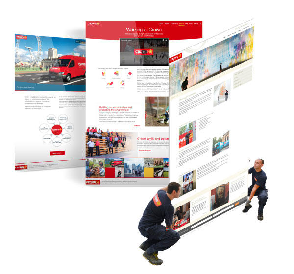
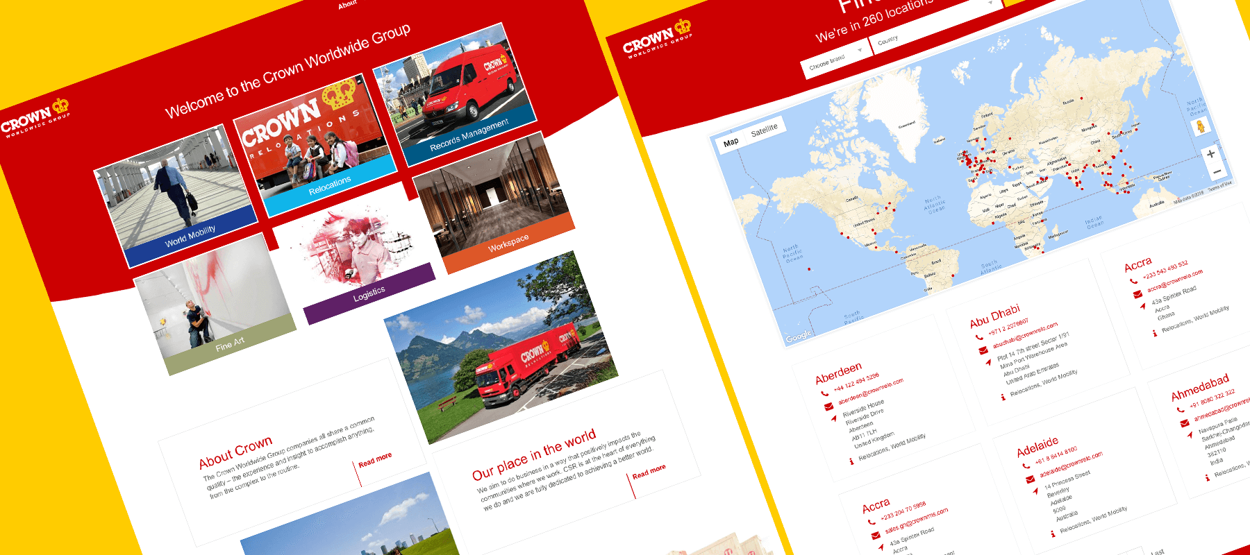
Our focus on unifying the aesthetics meant that Crown had a clearly identifiable family of websites. Nevertheless, we still made sure that each division had its own identity based on its own specialism. This ‘nesting’ approach simply reinforced what was already a strong international brand – enhancing their overall promotional strategy.
The analytics tools we built also provided key data and performance metrics that could be shared, influencing short, medium and long-term marketing decisions.
When the new sites launched, organic visits rose on average by 20%, and there was a 43% increase in online enquiries; it was also great to see a huge improvement in conversion rates – driving the business even further forward.
Discover how our team can help you on your journey.
Talk to us today