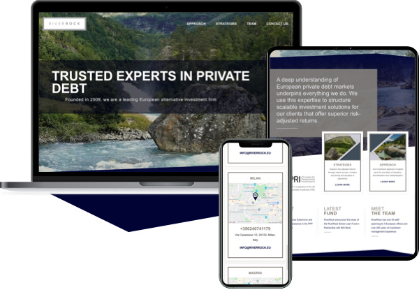
RiverRock had a dated website and struggled to visually represent themselves online.
They needed an impactful website that better represented them as a company to their clients, and an online presence that could continue to push their services online.
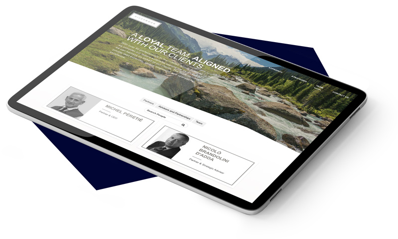
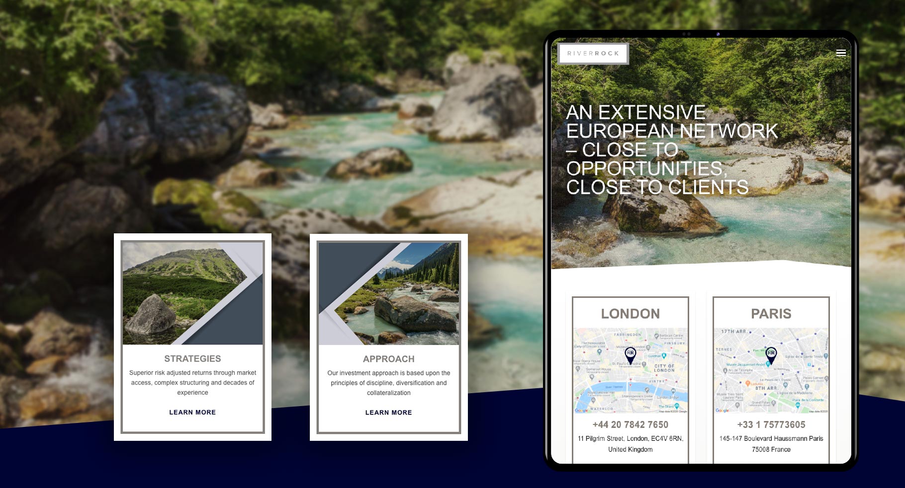
While the website template and structure was very quickly finalised, the challenge with this project was creating visual presences that RiverRock could be proud of and gave visitors a great first impression. Working with the client, we helped RiverRock express their brand by providing several different visualisations of their company online, stretching from European cities to a vast range of different natural themes.
From our experience we knew that monitor sizes vary in the financial sector, from laptops to larger desktop monitors, so it was important that the first impression of the website would look great for someone working on the go with a small laptop or tablet, or on a larger high resolution desktop monitor.
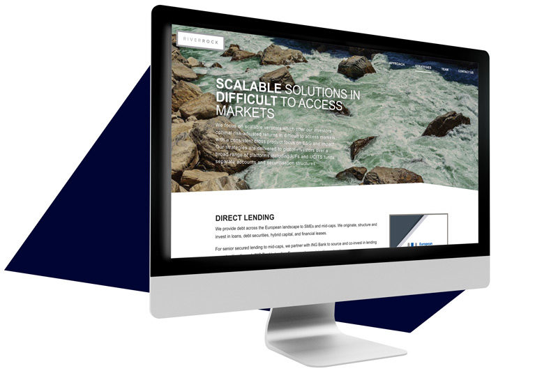
As part of the website we delivered a looping video that combined still imagery and moving water to give a memorable first impression, that gets all the more impressive on larger and higher end devices.
Following the launch of the website we have continued to work closely with RiverRock, tweaking and changing their website and marketing channels so that it continues to reflect them as the company grows.
Visit their website: riverrock.eu
