High-quality images instil trust and credibility in your company, so taking time and effort to source, create or take good photos is a vital part of any website content plan. We list some key things to look out for.
Size Matters
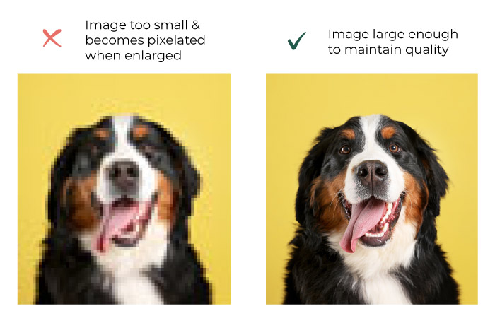
Images that are too small will become pixelated when enlarged. Make sure your source images are of a reasonable resolution – around 1000 pixels wide as a minimum. Make sure you keep the original as well, so you can always go back to it if needed.
Careful Cropping
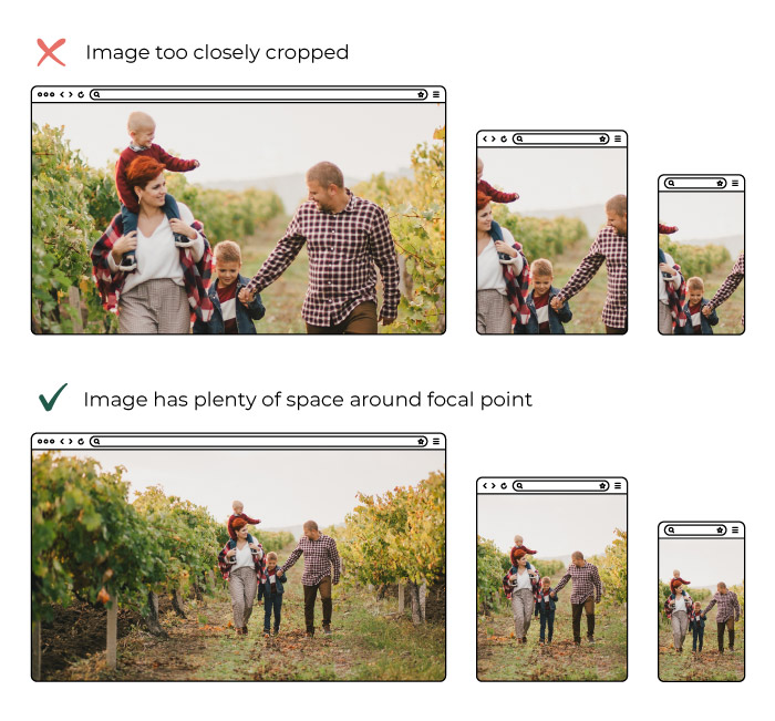
Subject matter not too closely cropped or “zoomed in”. Images on websites have to work “responsively” for each device size. This means as the site is viewed on a laptop a user can see more of an image than on a phone. If you’re cropped in too closely on a face, for example, you may find you can only see half a face on certain screen sizes. This does depend on how the site has been set up originally, but especially pertains to banner / hero photos. Because of this landscape photos are generally more useful for websites -a lot of imagery used is wider for desktop such as banner images.
Optimise
We love to get high-resolution photos. It means we have the option to crop and zoom as needed. But, having large files can mean a large file size, meaning they can be slow to download for the end user. We use a variety of tools make sure they’re quick loading, from saving them in the correct format initially, resizing them prior to upload to the site, to on-site image optimisation which further compresses images without any loss of quality. If you’re loading images yourself there’s a site that can help you compress them called tinypng.com
Text on Images
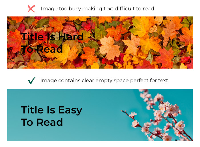
If the images are going in the background of text make sure they’re not too busy and that they’re made up of a colour that’s contrasting to the colour of the text in front otherwise the text will be difficult to read. This can be difficult to achieve, as photos are often taken with a close zoom to get the most impact, but these don’t always work well for websites.
Product Photos
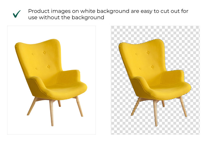
If you’re taking product imagery consider taking the photos on a white background this stops any distraction for the eye and leaves your product as the star of the show. It also allows for easy “cutting out” of the product so we can use the images overlaying other colours or images elsewhere on the site.
Subject
Make sure the photography conveys what you want it to. For instance if you want your website to show that your company is friendly and people oriented – get photographs of people interacting not only photos of your trendy office space.
License
Make sure you have permission to use the photography. Sadly you can’t just find any image on Google and use it on your website -you could be breaking copyright laws and receive costly fines from the right’s owner. If you don’t have your own photos to use then free resources such as Unsplash, Pexels and Pixabay have a wide choice. Alternatively, consider purchasing stock images online from sites such as Adobe Stock, Alamy or iStock.
AI Generation
In the last 12 months there has been a rapid rise of AI generated images, and the quality keeps improving. Sites like MidJourney, Canva and Dall-E allow you to type a prompt for what you want your image to be, and it’ll create one like magic.
Custom Photography
If you’re not comfortable taking your own photos, then hire someone. It’s not as expensive as you may think (if you pick the right agency/ person) and a carefully planned photoshoot can be used as assets for years to come. Make sure you know what you want out of any photo shoot though, and speak to your web developer about what ratio photos should be so your hero banners, product photos and / or team shots are the very best they can be.
